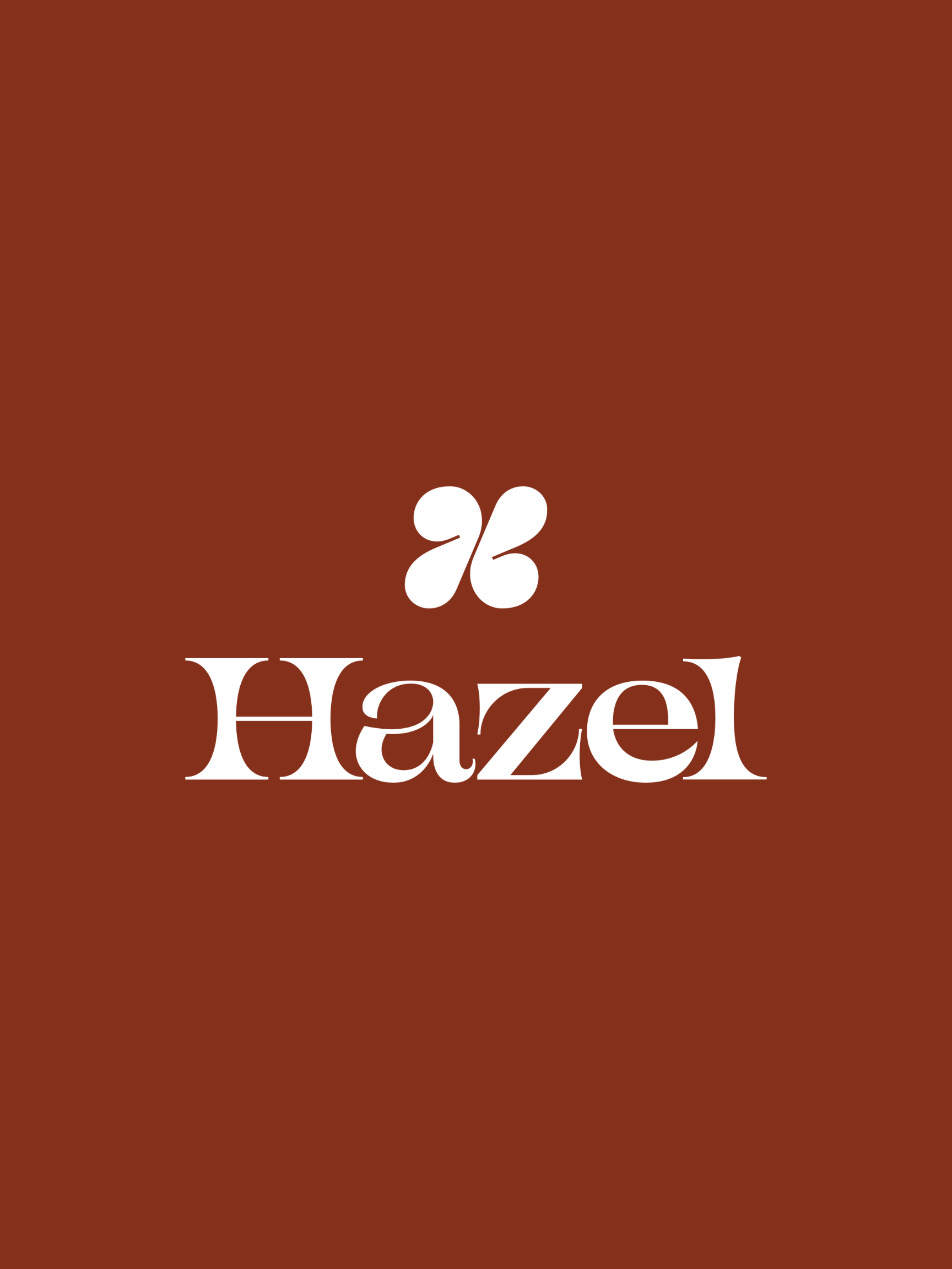
Hazel
Brand Identity
Luxe, innovative femme care for the ever-evolving woman.
Overview
Hazel is a luxe, innovative femme care brand for the ever-evolving woman. Our mission empower her with thoughtful, ground-breaking products, and the elevated experience she deserves.
For far too long, the incontinence category has made women feel ashamed and alienated (hello “adult diapers”); our products are all about boosting your confidence and making you feel like your marvelous self at every age.
Goals
Build a brand system and identity that resonates with an underserved and overlooked audience. Something that stands out from legacy brands and is inspired by the beauty supplies that she’s proud to use.
Brand Identity | Studio Mast
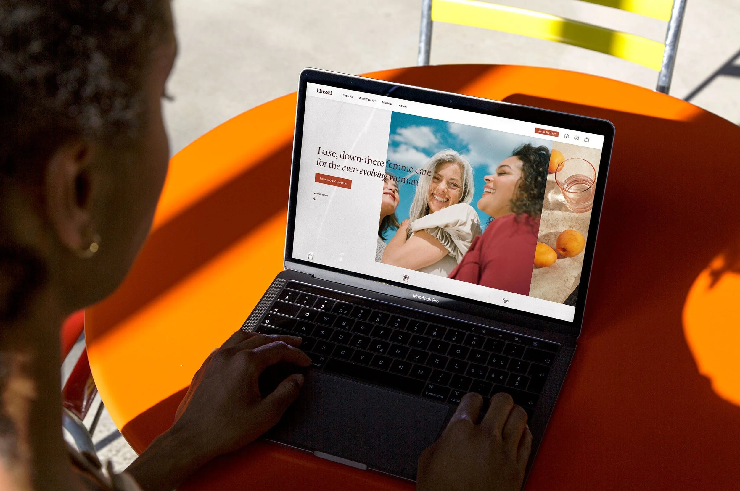
Website Design | Abigail Muir
Voice & Tone | Caitlin Snider
Copywriter | Ashley McAdams
Photography | Chloe Horseman & Tracie Davis
Illustration | Lisa Tegtemeir

Approach
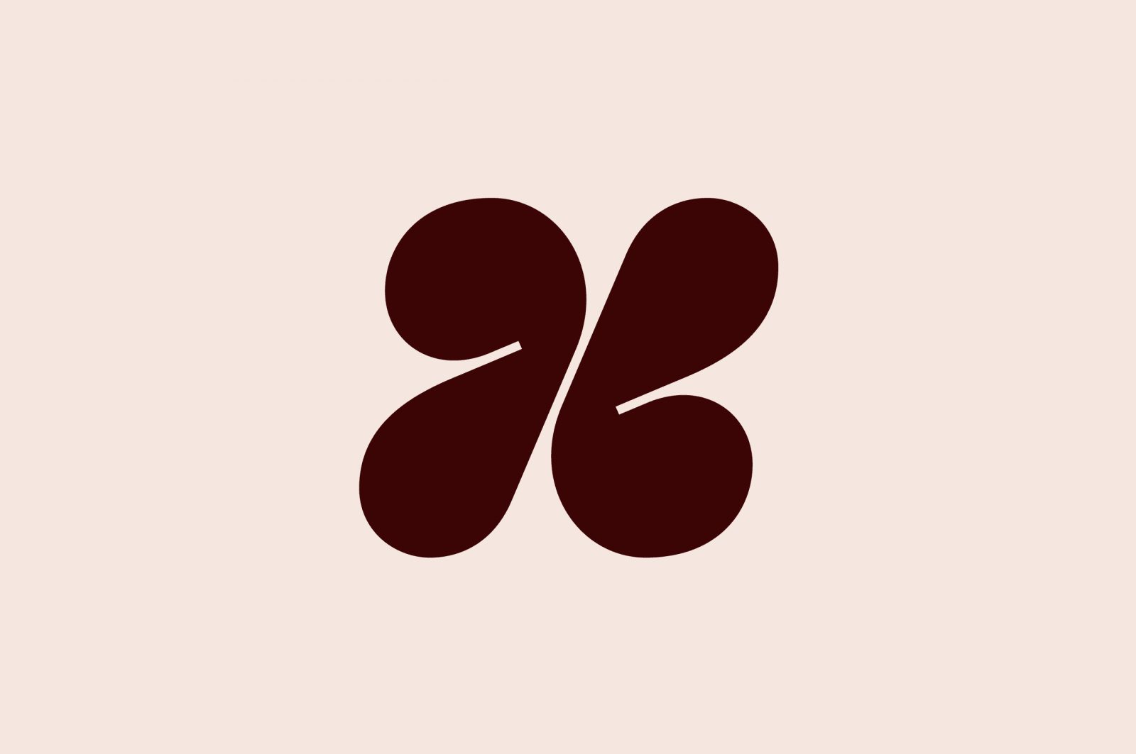
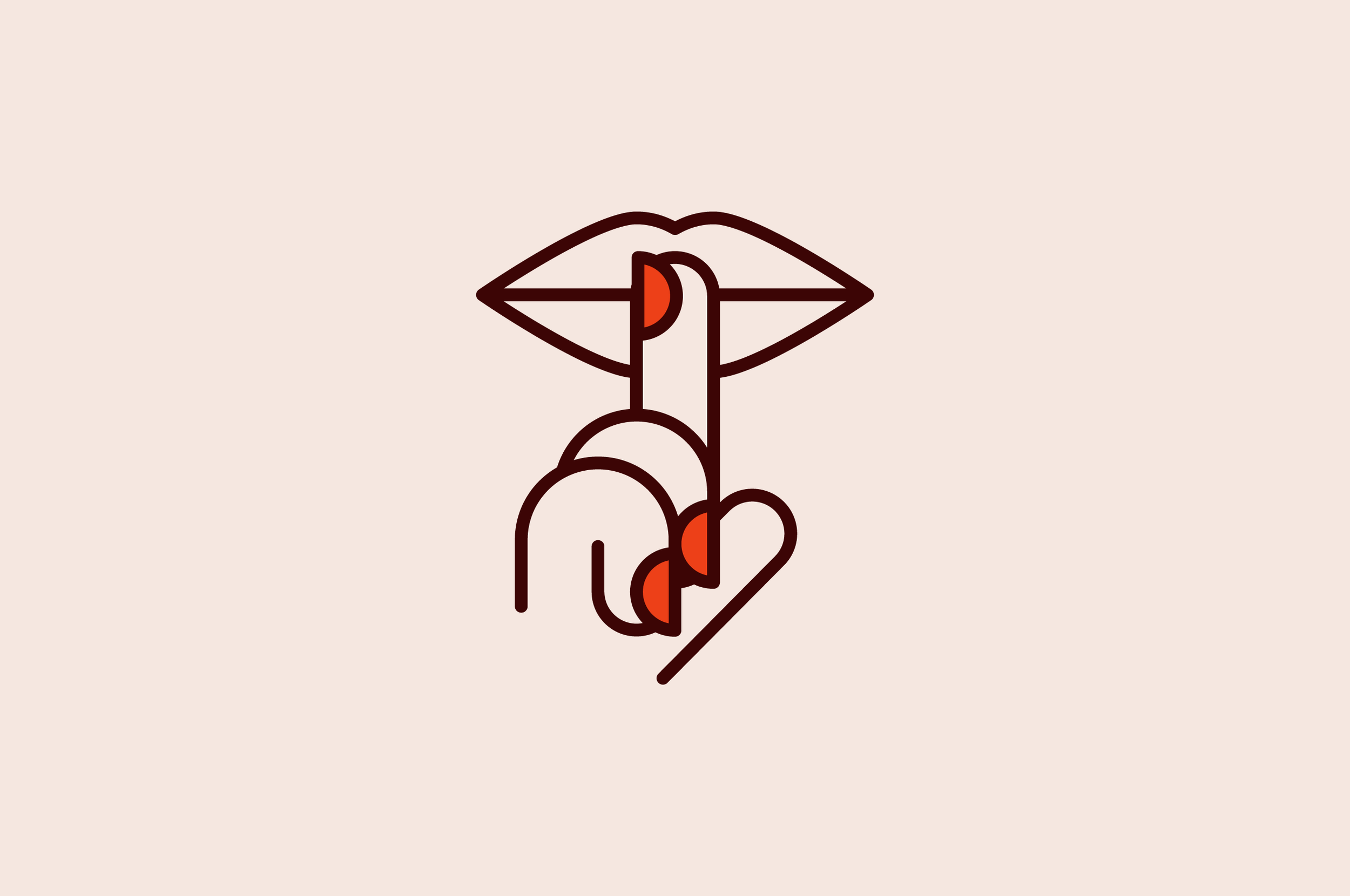
Alongside Studio Mast, we developed a wordmark, symbol, and system of iconography, illustration, and custom pattern elements to tell the story of Hazel.
We built a brand book that explained every detail of the brand voice & tone and explain just who our “muse” is. The brand book was shared with hundreds of women to make sure every word and color resonated.
Result
Hazel’s unique color palette, packaging system, voice & tone, and overall art direction led to product market fit and a community of women obsessed with not only our product, but the experience that comes with it. It’s fashion-forward, inspired by her beauty supplies, and full of emotion.